Warm White or Cool White: Reading Paint Undertones
Warm white or cool white paint? Learn to read undertones beside floors, trim and furnishings so your sample suits the colours already in the room.
Warm white or cool white paint can look like entirely different colours beside a timber floor, a grey sofa or a bright white ceiling. Imagine a homeowner choosing paint for a small sitting room: the first sample looks creamy on its own, but distinctly yellow beside the skirting; the second seems crisp on the card, then turns faintly blue next to a beige rug. The room’s nearby colours, not the name on the tin, are the useful comparison.
This invented walk-through follows that homeowner from an uncertain shortlist to a considered choice. The aim is not to declare one kind of white best, but to read the undertones that appear in relation to the room’s fixed and movable colours.
Reading the first samples
At the paint counter, our homeowner picks up two pale white cards. One has a soft ivory cast; the other appears clean with a cooler, faintly grey-blue cast. These descriptions are clues, not promises: a colour card is surrounded by other printed colours and may look different once placed in a room.
White paint is rarely neutral in the strict visual sense. Its base can lean towards yellow, red, pink, green, blue or grey, and a slight lean may become conspicuous beside a contrasting surface. Warm whites generally carry yellow, red or pink notes; cool whites more often suggest blue, green or grey. These are broad families, not a foolproof code printed on the tin.
The homeowner writes down the colour names and checks the manufacturer’s descriptions, but does not treat words such as “soft”, “clean” or “natural” as dependable undertone labels. A product description can narrow the shortlist; the actual sample still has to meet the room’s other colours.
The room’s colour neighbours
Before choosing, the homeowner looks at the colours that will remain: honey-toned boards, a pale greige sofa, chalky white skirting and a rug with a muted green pattern. Each is a neighbour against which the wall colour will be judged. The floor and sofa occupy broad areas, while the skirting creates a sharp edge right beside the proposed paint.
The homeowner places the two sample cards beside these surfaces, then moves them rather than judging them in isolation. Against the honey-toned boards, the ivory card seems to echo the floor’s warmth. Beside the sofa, though, that same card makes the fabric look slightly cooler and more grey. The cooler card gives the sofa a gentle, connected appearance, while the wood looks more golden by comparison.
Neither effect is automatically a fault. A warm white can make a cool grey furnishing look more distinct; a cool white can give warm timber a clearer, richer appearance. The question is whether the contrast feels intentional alongside the rest of the room, or whether one neighbour starts to look oddly discoloured.
Next, the homeowner compares each card with the skirting. The skirting is a bright, cool white, so the ivory card looks creamier at the join. That difference may be pleasing, but it could also make the existing trim seem stark. Looking at the edge reveals a relationship that disappears when the card is held against a blank wall.
Testing the actual paint
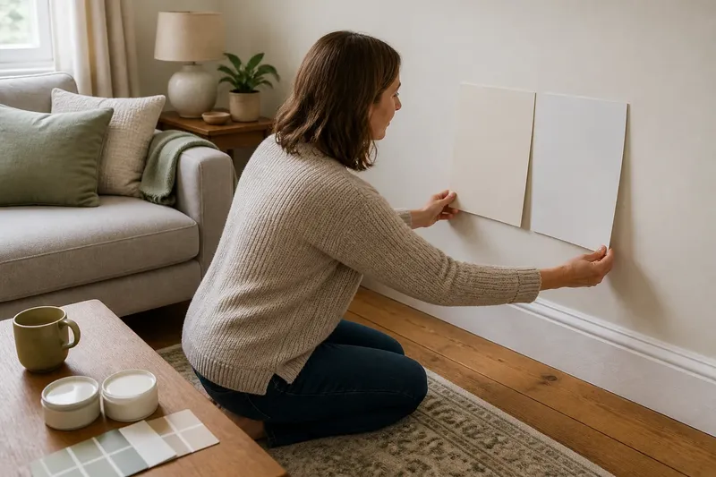
The cards have narrowed the choice, but small printed chips cannot show the full effect of a painted surface. Our homeowner buys sample pots of both contenders and uses separate pieces of sturdy lining paper, labelling the back of each with the colour name. This avoids committing a large wall area while keeping the samples easy to move.
Each colour goes on in a broad, opaque patch, with enough coverage to hide the paper beneath. A thin coat can let the backing show through and distort the comparison. The homeowner keeps the edges clean and does not paint one colour directly over the other, so neither sample gets an accidental visual border or contaminated edge.
Once dry, the paper is held beside the floor, skirting, sofa and rug in turn. The homeowner checks several spots rather than relying on one wall: near the timber, the ivory’s yellow note becomes more apparent; beside the rug’s green, the cool sample appears slightly bluer. Near the sofa, both work, but they create different degrees of contrast.
The swatches are then left in the room and viewed at different times. Daylight can shift in strength and colour across a room, while lamps bring their own cast. A white that looks balanced beside the rug in daylight may seem warmer under a lamp. This is not evidence that the paint has changed; it is a reminder that the surrounding light affects how its undertone is perceived.
The homeowner makes a short note at each viewing: which neighbour the sample is beside, what colour shift is noticeable, and whether the combination feels harmonious or distracting. This keeps the decision grounded in observable comparisons rather than a vague impression that one patch simply looks “nicer”.
What changed the choice?
At the start, the homeowner leaned towards the ivory sample because its name suggested comfort. The room, however, contains a cool sofa and cool-white trim as well as warm flooring. When all three are considered, the ivory sample makes the trim appear unusually blue-white and the sofa slightly dull.
The cooler sample brings the sofa and skirting into a closer visual family, but its blue cast becomes conspicuous beside the green rug. The homeowner moves the rug back into its usual position and compares the samples from the doorway, where the floor, sofa and rug can be seen together. From there, the cool white reads as a little too icy; the ivory looks more settled across the whole arrangement, despite its stronger contrast with the trim.
The final choice is a different warm white from the original ivory card: a pale shade whose yellow note appears more restrained beside the timber and less pronounced next to the sofa. The homeowner selects it after checking a larger dried sample beside the same colour neighbours. The result is not perfectly matched to every surface. Instead, it keeps the wood feeling warm without making the sofa appear unexpectedly grey.
This choice follows the room’s priorities. If the skirting were due to be repainted, the homeowner might select a trim white to coordinate with the walls. Since it is staying, a deliberate, visible difference is preferable to picking a wall white that almost matches but makes the trim look accidentally off-colour.
Questions about white undertones?
How can I tell if white paint is warm or cool?
Compare the sample with a clean sheet of white paper and with the room’s fixed colours, looking for a yellow, pink, green, blue or grey lean. Paper can help reveal a cast, but the floor, trim and furnishings provide the more relevant test.
Should wall paint match white trim?
It can match, contrast softly or contrast clearly; the right relationship depends on the trim and the other surfaces that remain. Compare both whites side by side, then decide whether the edge looks intentional from the main viewpoints in the room.
Does a warm white always suit a room with timber?
No. Timber may be honey-coloured, reddish, pale or greyed, and a warm wall colour can either sit comfortably beside it or make its undertone seem too strong. Check the particular floor rather than relying on “wood suits warm white” as a rule.
Why does a white sample look different at night?
Lamp light changes the colour surrounding the paint, so its undertone may look more or less noticeable after dark. View the dry sample under the lighting the room normally uses, as well as in daylight, before settling on a colour.
Choosing without a perfect match
For this invented sitting room, the useful decision was not “warm or cool?” in the abstract. It was whether the wall white made the timber, sofa, trim and rug feel like parts of one arrangement, while accepting that one pairing would remain more contrasting than the others.
When comparing warm white or cool white paint, keep the test beside the colours that will actually stay in the room. Choose a broad sample, let it dry, move it between neighbouring materials and look at it in the room’s usual light. If a surface is due to change, make the comparison against the intended replacement; otherwise, let the existing floor or trim have a genuine vote.
For this kind of choice, follow the paint maker’s directions for sampling and application. A final useful check is to stand where the room is normally entered: the first view often brings several colour neighbours together, making it easier to see whether the white connects them or pulls one out of tune.